Sunday, 15 September 2013
Saturday, 7 September 2013
Bread & Butter Berlin 2012 Summer – RELISH
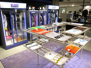
I posted previously about a retail shop that had great plant feature wall concept, which I haven't seen before in retail until space until now. I like the concept of bringing nature into retail if there is a good reason behind it however,this shop has gone way over the top. With whole walls covered with fake plants and grass flooring.
Having nearly whole shop covered in fake plants just makes the shop seem cheap and tacky.
Not only the walls are tacky but the fixtures seem boring and dull. The clothing rails look more like they belong in the stock room rather on the shop floor.
At least I can give thumbs up to the exterior of the shop, which draws attention. However when I still look at the exterior it just makes me think it's more of a restaurant or a flower shop rather than a retail space.
Mistral wine and champagne bar by Studio Arthur Casas and Sao Paulo
A new wine and champagne bar called Mistral. The space was long, hollow, and had high ceilings. Casas built
out the shop and used it’s length to his advantage. The architect designed a
long hallway, where the walls are angled and lined with a high gloss white
plastic, black mirror, and vertical slats of raw wood. Wine bottles are held in
the wall by cut out holes, just big enough for the bottle shaft.
With each label facing upward, Mistral’s store guests can walk through the shop
and easily view the products. The long hallway leads into the bar area, where
the wall materials from the wine display area continue. The space is modern, yet
warm and approachable; making it a great spot to grab some friends and enjoy a
wine tasting.
Replay Store by Vertical Garden Design, Florence
Browsing for inspiration for my uni project I came across this retail shop. I have seen this kind of concept before of green plant wall in restaurants however I haven't seen anything like this in retail shops, which seems pretty cool.
The project at the new Replay concept store in Florence was completed in spring 2009. The vertical garden is a part of an ecological theme developed by the architects. It covers a 7m high L-shaped wall in the 3-storey boutique.
The garden is inspired by the undergrowth of a temperate forest, similar to what
could be found in the lower parts of the hills not too far away from the city of
Florence. Although as with any indoor garden, the plants themselves are of
mostly of tropical origin to do well in the indoor climate. The overall picture
is a soft, yet dense and fresh greenery.
Friday, 6 September 2013
Wicker Hives at the New Hermes Paris
Looking like huge nests made out of lathe, the new interior of the Hermes boutique in Paris looks warm and inviting. Envisioned by the design house Rena Dumas architect, there are three large organic structures rise from the floor creating implied rooms to house Hermes products.
Wednesday, 14 August 2013
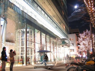
CRAZY WEDNESDAY: CAR ON A STICK CONCEPT
Designer Rob Lovegrove has a concept of a “car on a stick” a sort of cross between a car and a lamp-post.
The little bubble-shaped vehicle, with its strange, flower-like interior design, carries up to four passengers and their shopping around the mall, taking voice commands and using satellite navigation.
It’s solar powered, and completely electric, and when you’ve had enough of it, you just park it up. But there’s more, instead of taking up space and languishing unused at night, the little car somehow gets elevated on a telescopic pole, and lights up to become a street lamp.
Monday, 12 August 2013
Inside the campervan fit for a boy racer
Inside the campervan fit for a boy racer: £55,000 VW pimped up with flatscreen TVs, three electric sunroofs and Porsche alloy wheels
A company that customises VW campervans asked its employees to design their money-no-object, dream vehicle, and this is what they came up with.
A £55,000, state-of-the-art moving palace, with hidden Sony Bravia flatscreen TVs, rear-view camera, and ultra-high spec entertainment system.
The iconic VW Type 2 campervan has been customised by Bristol-based Danbury Motorcaravans, and costs twice the price of their average camper.
Pimp my ride: The Project 1 VW campervan boasts a host of features to justify its £55,000 price tag
Built as a one-off for fun, the van dubbed Project 1 has everything those who pimp vans for a living would want in their ultimate vehicle.
It comes with all the usual campervan regulars like a galley kitchen, comfortable seats and a bed, but also has top of the range features including two flatscreen TVs, three electric sunroofs, four swivelling chairs and Porsche alloy wheels.
The van also boasts super-bright headlights, a custom white, black and orange paint job, and a hidden king-size bed, while the whole chassis has been lowered to just a few inches off the floor.
The original vans were called Type 2, following on from their first offering the Type 1, which is better known nowadays as the Beetle.
Production in the UK stopped in 1967 but continued in South America, and Brazil is the only country in the world still manufacturing Type 2 campervans.
Danbury sells customised Type 2 campervans which cost from around £27,000.
A company that customises VW campervans asked its employees to design their money-no-object, dream vehicle, and this is what they came up with.
A £55,000, state-of-the-art moving palace, with hidden Sony Bravia flatscreen TVs, rear-view camera, and ultra-high spec entertainment system.
The iconic VW Type 2 campervan has been customised by Bristol-based Danbury Motorcaravans, and costs twice the price of their average camper.
Pimp my ride: The Project 1 VW campervan boasts a host of features to justify its £55,000 price tag
Built as a one-off for fun, the van dubbed Project 1 has everything those who pimp vans for a living would want in their ultimate vehicle.
It comes with all the usual campervan regulars like a galley kitchen, comfortable seats and a bed, but also has top of the range features including two flatscreen TVs, three electric sunroofs, four swivelling chairs and Porsche alloy wheels.
The van also boasts super-bright headlights, a custom white, black and orange paint job, and a hidden king-size bed, while the whole chassis has been lowered to just a few inches off the floor.
The £55,000 van boasts a sleek kitchen with fridge, cooker and sink, plus a king-size bed and flatscreen TVs
Production in the UK stopped in 1967 but continued in South America, and Brazil is the only country in the world still manufacturing Type 2 campervans.
Danbury sells customised Type 2 campervans which cost from around £27,000.
Monday, 29 July 2013
Ultimate in downsizing
Ultimate in downsizing: The £17,000 micro-house that covers just 65sqft and has a kitchen, bedroom and shower
The wooden Diogene house has a living space of 2.5 metres by 3 metres
Its interior is split in two and has a living room, shower, bed and storage
Diogene was created by the architect who designed The Shard in London
The energy-efficient micro-house is available to buy for £17,000
Italian architect Renzo Piano, famous for designing The Shard skyscraper in London, has created a micro-house called Diogene, pictured. It covers only 65sqft, can fit into the back of a lorry and comes with a kitchenette, shower and bedroom.
Energy for the appliances in the kitchenette is captured by solar panels fitted to the roof.
The structure also has a water collection system that captures rainwater and harvests it into drinking water.
http://www.dailymail.co.uk/sciencetech/article-2380727/Renzo-Piano-designs-17-000-Diogene-micro-house-covers-just-65-sq-ft-fit-lorry-kitchen-bedroom-shower-storage.html
Italian architect Renzo Piano, famous for designing The Shard skyscraper in London, has created a micro-house called Diogene, pictured. It covers only 65sqft, can fit into the back of a lorry and comes with a kitchenette, shower and bedroom.
The interior is split into two halves with a living room in the front, consisting of a pullout sofa, folding table, chairs and storage. The rear of the house, situated behind a partition, is a small kitchen with electric stove and fridge, a shower and toilet, and more storage.
The Diogene house pictured from above. The £17,200 building has a front and back door. It is 12ft tall and the bed sleeps a person up to around 6ft tall
Energy for the appliances in the kitchenette is captured by solar panels fitted to the roof.
The structure also has a water collection system that captures rainwater and harvests it into drinking water.
http://www.dailymail.co.uk/sciencetech/article-2380727/Renzo-Piano-designs-17-000-Diogene-micro-house-covers-just-65-sq-ft-fit-lorry-kitchen-bedroom-shower-storage.html
Sunday, 26 May 2013
Pictured: The three best homes built in America in 2012 (one even comes with a living room IN a forest)
The American Institute of Architects announced the winners of the 2013 AIA/HUD Secretary Housing Award with the top prize going to a contemporary-styled home in Orca Islands, Washington State.
At the request of the artist owner Marie Gladwish, who also happens to be the mother of architect Gary Gladwish, the home utilizes its natural backdrop and even comes with a living room in the woods.
The second-place home known as Halls Ridge Knoll is on a site formerly a cattle ranch and now a prime vacation retreat in the Santa Lucia Preserve.
Stone, timber and glass were all used for home that overlooks the San Clemente Mountains.
Perhaps the most unique feature to the home the sliding doors which open out onto a wood-paneled deck. Because of California's unique weather, the outdoor pool is also a solid year-round feature.
A solar thermal system operates the pool, spa and outdoor area which has a fireplace and a retractable movie screen.
The smart house with its high array of sensors is over thirty percent more energy efficient than comparable homes nearby.
At the request of the artist owner Marie Gladwish, who also happens to be the mother of architect Gary Gladwish, the home utilizes its natural backdrop and even comes with a living room in the woods.
A sliding panel door separates the outside from the inside
The two other top contenders also made the most of their natural surroundings in California and Colorado and both have pools that can be used year-round.
The hilltop location offers incredible views of the Canadian Gulf Islands
LED and compact fluorescent lights are used throughout the home
The voting body for the American Institute of Architects appreciated the 'Zen-like' quality of the home
Stone, timber and glass were all used for home that overlooks the San Clemente Mountains.
Perhaps the most unique feature to the home the sliding doors which open out onto a wood-paneled deck. Because of California's unique weather, the outdoor pool is also a solid year-round feature.
California climate is enviable this is a heated pool
Wood used for this deck was salvaged from a nearby barn
The home provides astonishing views of the San Clemente Mountains
In third place is a 2,850 square foot home in Colorado that features three bedrooms, a dining room and a kitchen area that overlook the Rocky Mountains. A solar thermal system operates the pool, spa and outdoor area which has a fireplace and a retractable movie screen.
The smart house with its high array of sensors is over thirty percent more energy efficient than comparable homes nearby.
The unique roofing structure has the home blending in to the scenery
Smart programming sensors keep the home energy efficient
An outdoor fireplace accommodates many of those chilly Rocky Mountain nights
The heated pool has views of the surrounding mountain terrain
Subscribe to:
Comments (Atom)


