Thursday, 22 December 2011

Stunning Sculptural Staircase by Philip Watts Design

Philip Watts Design has created stunning sculptural staircase for a private client. The Northampton staircase is a reminder of the shape of the spine or an elongated shiny ribcage.

Maybe this stunning sculptural staircase inspired by the shape of the ribs. Philip Watts Design  creates the sculptural staircase with glass and timber details to make a dramatic impression. This stunning staircase has so much influence in an interior scheme and certainly makes an unforgettable statement.


House Interior Design with Glass Wall

View to view to die for.

This is house interior design with glass wall which offers a great view out there. This house interior design with simple ideas use plants for indoor decoration which makes a fresh atmosphere. The glass wall makes the house interior design look blend with the natural surroundings.

However I am not sure if I would want the whole house to be glass, I think maybe it would feel like I am living in a gold fish bowl.

Tubohotel

How crazy is this ?
Even the name sounds crazy a hotel made of tubes and it is exactly what it sounds like.

Some are stacked in a pyramid shape. The tubes keep a pretty consistent temperature and even come with electrical outlets and WiFi.

At Tubohotel, you book your own private giant concrete tube, which includes a queen sized bed, bedding, storage, curtains, and lighting.
 
Located about 45 minutes south of Mexico City in the scenic area of Tepoztlan

DFL Lamps Design

This is my Lamp design that I have designed and made by my self for my Interior Architecture project.
Been Interior Designer is not just about exterior/interior design sometimes you get asked to design a piece of furniture to go into specific interior space. I wanted to design something that acualy is a working model.

I wanted to design something simple that would fit most interior designs yet different in some way.

When I was coming to the end of the development process I started to realise that the design of the lamp could be utilised for many purposes. This includes a floor and ceiling lamp. 


Acual Model

Monday, 12 December 2011

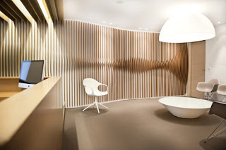
ORL Clinic by Mal Vi Architects

I really wanted to show this Interior Design as it's very similar to the furniture design below this post, however the two designs has nothing to do with each other. I find it quite interesting and obviously I like it as it’s different from everyday interior design we see where ever we go.


The ORL Clinic by Mal-Vi Architects, located in Thessaloniki (Greece), was designed for a surgeon new to the area who wanted a memorable office space, much different than you would expect to see from the average doctor.


The wooden sculptural surfaces were created using medium-density fiberboard and offer a nice contrast to the rest of the space, left mostly white. The main waiting room’s walls are decorated with the Hippocratic oath, with some of its most important words standing out in laser-cut acrylic glass.

The Accordion Cabinet

The Accordion Cabinet by designer Elisa Strozyk and artist Sebastian Neeb is a bookshelf that stands on long legs with a set of flexible doors.

Opening and closing the cabinet resembles the folding of an accordion. Using wooden textiles, the duo was able to get the look they desired while still allowing the cabinet doors to flex easily.

Friday, 2 December 2011

Lamp By YEONGWOO KIM

Yeongwoo Kim is a industrial designer from South Korea. 


I absolutely love her designs, I do not know why but they just scream out LOOK AT ME (I am different) you just do not see lamp designs like these every day specialy in a furnuture/light shops.   


Thursday, 24 November 2011

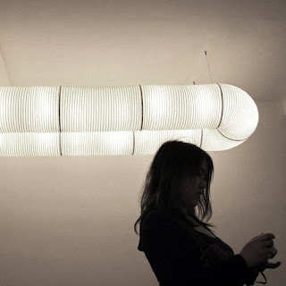
Tekio By Anthony Dickens


Yes many viewing this will think what the hell is that, well ladies and gentlemen it is a LAMP SHADE by
Anthony Dickens.

Anthony Dickens travels as well as the Japanese Cochin paper lantern inspired the Tekio lighting system. Tekio is the Japanese word for (adaptation) The framed paper tubes can be bent and connected into any shape that you desire so your options are limitless.


Tuesday, 22 November 2011

House on the Bluffs by Taylor Smith Architects


Located on the Scarborough Bluffs on the shoreline of Lake Ontario in Toronto, Canada, the house was built on the same foundation of the owner’s childhood home. The house, designed by Taylor Smyth Architects, features clean, modern lines that fit well within the mature landscape that closely surrounds it. Local limestone covers the recessed walls on the front of the house and is carried on throughout the inside, bringing the outside in.
I absolutely love this design front of the house definitely brings the outside in, I really like the idea of use of glass, large windows/glass walls brings natural light in which I think is very important in todays design.

The Baltic Exhibition


The world's most recognised and prestigious award for contemporary art, the Turner Prize presents the very best of current British art.

My latest visit to the Baltic (Newcastle) Exhibition.

Karla Black’s work draws from a multiplicity of artistic traditions. Her large scale sculptures include modest everyday substances, along with very traditional art-making materials to create abstract formations.

A large blanket of cling film is draped across the floor coated with baby oil gel and paint, the liquid balms the surface and collects in its crevices as pools, creating a microcosmic ecology suggestive of generation and sustainability.


I actualy don't know what to think about her design ideas, yes there is a nice concept behind it
but maybe a 5 year old would have a same simolor idea.


Martin Boyce's work creates atmospheric, sculptural art inspired by modernist design history, which it often directly quotes, writes Matthew Cain.
Typically, Boyce's work relates to and transforms the space around it, creating atmospheric, sculptural art inspired by modernist design history, which it often directly quotes.
This major exhibition of the work of British artist George Shaw brings together some forty paintings from 1996 to the present day. Within a practice that has encompassed drawing, video-making, performance and writing, Shaw is best known for his expansive body of painting.

So yes I thought the whole exhibition was a disappointment compare to my last visit.

Sunday, 13 November 2011

The Hannah Nunn collection

The Hannah Nunn collection is a beautiful range of paper cut lighting inspired by the botanical world.

Hannah designs and makes the lamps in her workshop within Radiance her lighting and craft boutique in Hebden Bridge, West Yorkshire.
You can choose from  from table lamps, wall lamps, floor lamps, pendant lampshades.

 Lamps


Ceiling Shades


Tuesday, 8 November 2011

The Colago aka the Hangman Lamp

Been a young student designer I have came across some weird lamps but nothing like this before. The idea has came obviously from the most simple game know to every one (Hangman). It is simple however very different and that's why I like it, as it's not something that you would see every day.
The lamp has been handmade and materials used electric wire and iron.

Sunday, 6 November 2011

Hush pod chair


How cool are these Hush pod chairs from designer Freyja Sewell ? Designed to create an enclosed personal retreat, these chairs can also be folded to create a more traditional seat.

Hush is made from 100% wool felt and its cushions are stuffed with recycled wool fibers.
Hush was recently selected for Grand Designs Live as one of Kevin McClouds Green Heros.

Monday, 31 October 2011

For this project I have worked in a team of 4, each one of us has designed a floor each.
As I have designed the living room area I wanted to bring a lot of natural materials into the design like conker flooring, bamboo and other type of wood furniture.
The fire place is built into the wall and is made from glass that lets the natural light in and you are able to see through it. The wall acts like a parition wall, dividing one large area into two.

Living room design based on the mood board